Today was like Christmas in August thanks to Tim Holtz.
Every year I design Tim's catalog for Sizzix and all of his packaging for his Alterations line. I adore working with him. He truly has the ability to know how something will look before it is created which makes my job so much easier.
Earlier this year I caught up with him at the Stampers' Convention in Carson, CA and he was so sweet to offer to send me some product if I would send him my wish list. It took several weeks of making and then trimming down my wish list but I finally sent it off to him and today a box full of creative magic arrived from him.
It felt like Christmas morning as I carefully opened the box. There is more awesomeness in this one box than I could ever imagine. And, as Tim said to me today "You're going to have a lot of fun!" Where to begin and how will I ever find the time to play with everything? I could just squeal with happiness.
Thanks Tim and Mario!
Showing posts with label Distress Inks. Show all posts
Thursday, August 28, 2014
Saturday, October 26, 2013
Experimental Halloween Tags
Once a week I spend my lunch hour playing with the dies, inks, stains, paints, etc. in the art room at work. It is definitely one of the perks to working at a crafting company.
I have been experimenting with painting and inking a lot of tags and decided to use a couple of them to create some Halloween projects.
The Happy Halloween tag began with lots of Distress Paints and Stains in a variety of layers and techniques. Once I was happy with the look of the tag I used a thin sheet of scrap cardstock and die cut the word "Boo" using the Gothic Boo die by Sizzix. I sprayed the back lightly with adhesive to temporarily hold it in place on the tag. Next, I sprayed Perfect Pearls Heirloom Gold using the die cut shape as a stencil.
I wanted to experiment with Tim Holtz's new Framelits and Stamps so I used the Retro Halloween Set {the Owl} and Cobweb Blueprint Set {words "Happy Halloween"}. My only suggestion would be to use very dark ink if you are going to stamp on colored paper. Other than that these were super fun and easy.
Other shapes I used include the Bird Branch {I trimmed off the bird} and the Mini Owl and Crescent Moon {Moon only}. I adhered everything to the tag and love how the subtle shimmer of the Perfect Pearls makes it look like moon beams.
My next tag is a Pumpkin tag which began with a thick layer of Distress Paint so there would be brush strokes visible once it dried. I used Distress Stains and Distress Inks in a variety of Autumn colors and techniques on top of the paint. The darker colors made the texture stand out nicely.
I also splattered water to create droplets which is my favorite Tim Holtz technique.
After I was satisfied with the colors and textures of the tag I die cut the eyes using only the triangle eyes from the Sizzix Mini Scary Jack-o-Lantern Set and using the Base Tray.
The next part was an experiment that happily worked out as I had hoped. I cut the mouth by using the same Mini Scary Jack-o-Lantern die and Tray but instead of using a regular Cutting Pad, I used the Embossing Diffuser Set #2 so that I could control exactly where the die would cut.
I began with a regular Cutting Pad on the bottom, then the Base Tray with the Jack-o-Lantern mouth die only, next I placed my tag and finally an Embossing Diffuser insert piece placed over the upper part of the mouth die. I ran this through the Big Shot so that it only cut where the Embossing Diffuser insert piece was and this created a single jagged mouth cut across my tag.
To reassemble the two pieces, I tilted the bottom piece and stapled them together on one side.
As a final detail, I used Distress Inks to age a piece of green ribbon to use as a stem for my Pumpkin Tag.
This is linked to:
504 Main, Common Ground, Homework, Just Us Four, Kathe With an E, Ladybug Blessings, Mad in Crafts, Sew Much Ado, Simply Designing, Tatertots and Jello, The Crafty Blog Stalker, The DIY Dreamer and Whipperberry
Sunday, March 31, 2013
Designer Crafts Connection Blog Hop - April
Welcome to the Designer Crafts Connection Blog Hop for the month of April. This month's theme is "Handmade Flowers" with an added challenge to create with things around the house. A perfect combination that is dear to my heart. I started looking through my stash and came across something I had been saving for a "someday" project, the pretty fabric bag that held my shabby chic duvet cover.
The finished project is a canvas tote decorated with the Tattered Floral Sizzix die. The lining of my bag is the intact duvet cover bag {see the floral bag below}. For the outside of the bag, I used leftover painter's drop cloth from previous projects here and here. I first cut and sewed the drop cloth to match the size and shape of the duvet cover bag.
Next I die cut some Tattered Florals out of more drop cloth material and applied a little Worn Lipstick Distress ink on the petal edges. This created the outer part of my flowers.
I wanted to use a different material for the center of the flowers to add texture and interest. I found a vinyl bag of decorative sea shells sitting around. I cut a different flower shape out of the vinyl and used Cranberry and Butterscotch Alcohol Ink to color the narrower petals.
I used embroidery thread and thrifted pearl beads to attach the flowers to the bag. At this point the flowers started to look like climbing Clematis. Using Broken China Distress ink, I added a hint of blue behind the flowers to tie in with the colors in the lining.
I sewed handles and then stitched the bag together. This entire project was created using only items that I had around my house. I love doing projects like this.
I hope you enjoyed my Handmade Flowers. Please use the Forward/Back button on the right column to continue through the DCC Blog Hop for more amazing floral inspiration.
This is linked to:
DIY Home Sweet Home, Homemaker on a Dime, Making the World Cuter, Sew Can Do and Skip to My Lou
The finished project is a canvas tote decorated with the Tattered Floral Sizzix die. The lining of my bag is the intact duvet cover bag {see the floral bag below}. For the outside of the bag, I used leftover painter's drop cloth from previous projects here and here. I first cut and sewed the drop cloth to match the size and shape of the duvet cover bag.
I wanted to use a different material for the center of the flowers to add texture and interest. I found a vinyl bag of decorative sea shells sitting around. I cut a different flower shape out of the vinyl and used Cranberry and Butterscotch Alcohol Ink to color the narrower petals.
I used embroidery thread and thrifted pearl beads to attach the flowers to the bag. At this point the flowers started to look like climbing Clematis. Using Broken China Distress ink, I added a hint of blue behind the flowers to tie in with the colors in the lining.
I hope you enjoyed my Handmade Flowers. Please use the Forward/Back button on the right column to continue through the DCC Blog Hop for more amazing floral inspiration.
This is linked to:
DIY Home Sweet Home, Homemaker on a Dime, Making the World Cuter, Sew Can Do and Skip to My Lou
Monday, December 3, 2012
Designers Craft Connection Blog Hop - December
Welcome to the Designers Craft Connection Blog Hop for the month of December. This month's theme is "Handmade for the Holidays".
I am excited about this month's theme because; 1) I love making things, 2) I love the holidays and 3) I had a perfect idea for a dual-purpose project.
My sister and I exchange handmade ornaments every year. This year our theme was "Something Made of Paper". So combining the themes I created a "Tim Holtz Cuckoo Clock" ornament.
I hope you enjoyed my Handmade for the Holidays project. Please use the DCC Blog Hop button on the right to visit all of the talented designers and see their creative projects.
This is linked to:
Beyond the Picket Fence, Coastal Charm, Elizabeth and Co., Making the World Cuter, My Uncommon Slice of Suburbia, Savvy Southern Style, Sew Can Do, Sew Much Ado, Someday Crafts, Sugar Bee Crafts, The Shabby Creek Cottage, The Thrifty Home, The Trendy Treehouse, Topsy Turvy and Twin Dragonfly Designs
I am excited about this month's theme because; 1) I love making things, 2) I love the holidays and 3) I had a perfect idea for a dual-purpose project.
My sister and I exchange handmade ornaments every year. This year our theme was "Something Made of Paper". So combining the themes I created a "Tim Holtz Cuckoo Clock" ornament.
I began by covering a small box with old sheet music. This happened to be from The Nutcracker Suite in case anyone happens to notice. Before I sealed up the box I punched two small holes in the bottom of the box and ran a small chain through it leaving both ends hanging out of the bottom. I sealed up the box and used Distress inks to age the paper edges.
Using all Sizzix dies, I die cut two Tattered Pinecone pieces and followed Tim Holtz's video to create the pinecones hanging beneath the clock. I added some snowy glitter using white glue.
I cut out a House, 3-D and used the Woodgrain Texture Fade for added dimension to the sides. Again, using Distress inks I highlighted the raised texture. I cut an opening near the top arch and attached a small die cut Cardinal {more festive than a Cuckoo Bird}.
I die cut the Weathered Clock and first applied Tea Dye Distress ink as a background color. Next, I used Perfect Medium with an all-over pattern stamp and applied Perfect Pearls in Heirloom Gold. This created a random, worn metallic look to the clock face. Before assembling the clock/house I laid the clock face on the front and determined where the clock hands would be attached. I used a small brad to attach the hands then removed the clock face while I worked on the next steps.
I assembled the clock/house and decided that it needed a roof. I folded a piece of brown cardstock and ran both sides through my Vagabond die cutting machine using the Snowflurries Texture Fade. I sanded the raised surface to give it more texture. I also added a small piece of die cut Vintage Lace along the front edge of the roof. It is cut from more old sheet music and left over from a previous project. It gave the house a gingerbread roof line. I used a large needle to punch two holes in the roof and top of the house. I glued the roof to the house then strung a piece of vintage ribbon through the holes.
I used hot glue to attach the house to the bottom box. I glued the clock face to both the house and the base. On the left side of the clock I added a small bottlebrush tree. On the right, I glued a small die cut Reindeer.I hope you enjoyed my Handmade for the Holidays project. Please use the DCC Blog Hop button on the right to visit all of the talented designers and see their creative projects.
This is linked to:
Beyond the Picket Fence, Coastal Charm, Elizabeth and Co., Making the World Cuter, My Uncommon Slice of Suburbia, Savvy Southern Style, Sew Can Do, Sew Much Ado, Someday Crafts, Sugar Bee Crafts, The Shabby Creek Cottage, The Thrifty Home, The Trendy Treehouse, Topsy Turvy and Twin Dragonfly Designs
Tuesday, March 6, 2012
12 Tags of 2012 - Retro Flower Power Tag of March
This is the second tag challenge for Tim Holtz's 12 Tags of 2012. I was so excited to start working on the new tag. You can see the inspiration piece on his blog here.
Tim's tag looked like it was inspired by the beginning of Spring, I decided to do a Retro Flower Power version for my tag. As always, I tried to use as many thrifted or vintage items as possible.
You can experiment and get other effects. It tends to look better on darker inks. This is my attempt at a tie-dye effect for my retro tag.
Next I used Alcohol Inks on the clear butterflies. I always like to make my butterflies as symmetrical as possible. I applied the Alcohol Ink on one side and Silver Mixative on the opposite side so that they would not blend.
The butterfly on the right shows the alcohol ink side up. The one in the middle shows the mixative side up. The one on the left is folded for added dimension.
I began assembling the tag by adhering the Film Strip Ribbon and butterflies to the tag using Glossy Accents. I used the Film Strip ribbon as a "trellis" to visually support my flower. Next, I used a glue gun to adhere the flowers.
Tim's tag looked like it was inspired by the beginning of Spring, I decided to do a Retro Flower Power version for my tag. As always, I tried to use as many thrifted or vintage items as possible.
I first cut the tag out of cardstock using the Sizzix Tag and Bookplates die. I also cut some butterflies out of the recycled clear die packaging using the Mini Butterflies Set. The flowers are all vintage thrifted earrings with their backings cut off.
I first stamped the words using archival black ink. Next, I used Distress Inks in Peeled Paint, Dusty Concord and Stormy Sky and rubbed them on a Non-stick Craft Sheet then lightly spritzed water across all of the colors. I pulled my tag across the inks until I liked how it looked. While the inks were wet, I quickly sprinkled salt across the surface. The salt causes a resist effect with the water and when the ink dries there is a subtle but interesting texture.
Salt on the surface
After the ink dries and the salt is completely brushed away
Another example of the salt effect on the ink
Next I used Alcohol Inks on the clear butterflies. I always like to make my butterflies as symmetrical as possible. I applied the Alcohol Ink on one side and Silver Mixative on the opposite side so that they would not blend.
The butterfly on the right shows the alcohol ink side up. The one in the middle shows the mixative side up. The one on the left is folded for added dimension.
I began assembling the tag by adhering the Film Strip Ribbon and butterflies to the tag using Glossy Accents. I used the Film Strip ribbon as a "trellis" to visually support my flower. Next, I used a glue gun to adhere the flowers.
I used a thrifted piece of vintage Rayon seam binding for the ribbon. I laid it on the Craft Sheet and rubbed the Peeled Paint Distress Ink pad across it. Then I crunched it up and used it to wipe up any excess ink on the Craft Sheet. This created the wrinkled, distressed look on the ribbon.
I'm having a great time playing in the Studio.
This is linked to:
Thursday, November 11, 2010
Sizzix Triple Play Blog Hop - Twist Cube, 3-D
Welcome to Week 2 of the Sizzix Triple Play Blog Hop. The featured die is the Sizzix Cube, Twist 3-D pop-up Bigz XL die by Karen Burniston. I had a lot of fun with this project so I included a lot of details regarding products used and various techniques.
My design concept was to try and use as many Tim Holtz products from my stash as possible. I started off by doing a lot of sketches and some test cuts to see how everything went together. When I was ready I cut all of my pieces from tan cardstock (the only product I had to purchase) and made little piles of embellishments that I planned to use on each side. Next came the fun part of decorating the sides.
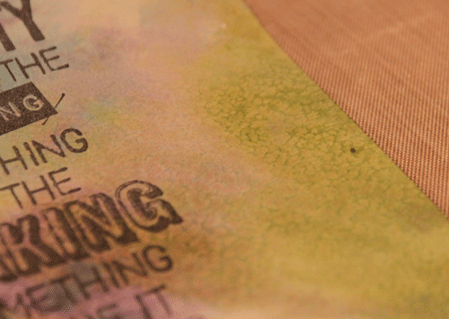
The image above is the top with the cube folded flat. I used the Sizzix Retro Circles Texture Fades to create the pattern in the paper and Distress inks in Spiced Marmalade, Tea Dyed and Barn Door. I applied the inks using the technique in Tim's Compendium of Curiosities (CC) book, page 33. I attached the Button (my stash) by inserting the stem of the button through the cardstock and attaching it with wire hidden inside and then looping a Ball Chain around the button. Other products used: Journaling Ticket and ABC Skid alphabet stickers by Creative Imaginations. The other items you see along the edges are actually parts of the various sides of the cube and will be described later.
On the front of the cube I used the Cracked Texture Fades and applied the same colors of Distress inks plus Dusty Concord using the CC technique on page 40. The die cut shape is the Styled Label stamped with the Crown from the Regal Flourish stamp set using the technique on CC page 37. I also added a Game Spinner.
The left side has two paper images from the Graphics Fairy. The crown paper just worked so perfectly in this design. The stamp in the corner is part of the Regal Flourish set using Black Soot Distress Ink. I also used some Traveler Tissue Tape, Ball Chain and Type Charm. I punched a small hole on the front and side of the cube and hung the Type Charm from the corner.
The back was a little more free-formed. I used the same inking technique on CC page 33 but without the Texture Fade so the ink blended on the paper surface. The Clock is from the Journey stamp set. The Wings (top right corner) are die cut from plastic packaging using the Sizzix Heart Wings die and then embossed with the Patchwork Texture Fade. I inked them with Alcohol inks in Purple Twilight and Sunset Orange.
On the right side I inked all of the edges before assembling so I was able to get crisp edges. The wing is created with the Regal Flourish stamp and Perfect Pearls using the CC technique on page 38. The Crown is die cut from Grunge Paper using the Sizzix Heart Wings die then I applied Rock Candy Distress Crackle Paint and Dusty Concord ink using the technique on CC page 42. It is attached using a Memo Pin. Other product used: Filmstrip Ribbon with a bit of Alcohol ink for color.
The bottom side worked well because I used only three main colors of Distress inks in this project so, although the panels are all very different, they visually work together. I used a French postcard image and a French map image from the Graphics Fairy on two panels. The other panel is a continuation of the side. I added more Traveler Tissue Tape and a stamp from the Journey set.
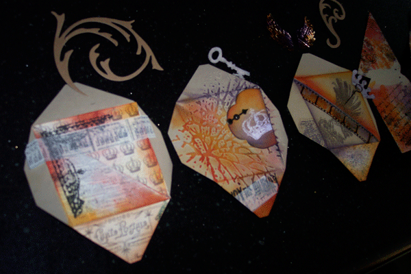
I didn't want to ruin the surprise of the completed cube so I left these last two photos for the end. As I said at the beginning, I did sketches and made samples to see how everything would work together. Before assembing the final cube I laid everything out to see how it would work. Here are the photos prior to assembly. You can see in these photos that I had additional embellishments (Swirls and Key) that I did not use in the final piece.
I hope you enjoy this example of the Twist Cube as much as I enjoyed making it. And thanks to Karen Burniston for designing such a clever die.
Please continue on through the Blog Hop using the Forward or Back links in the Triple Play Blog Hop blinkie. And please be sure to visit again next Thursday when the featured die will be the Flower, Beauty Bloom.
Thursday, October 14, 2010
Bottle of Poison
Today I Created | A poison bottle label.
I started off with the image of a skull from the Graphics Fairy. I printed this on a sheet of cardstock leaving lots of space on the left side of the sheet.
I then ran this through the Poison, Texture Fades. Since the cardstock was white I used the Antique Linen Distress Ink to age the entire paper. I used a paper edge distresser to roughen the edges of the cardstock. I applied Tea Stain Distress ink to give it more age. Since I felt that it was still too bright, I sprayed some Suede, Glimmer Mist on the corners.
After this was completed, I realized that this label needed to be attached to something. I had an old-looking, hand-blown bottle that looked just old enough and odd enough to perhaps hold poison.
A perfect Halloween decoration. Enjoy!
Tuesday, September 28, 2010
Artistamp Experiment
Today I Created | A sheet of artistamps.
This was a totally new experience for me. I was given some Postage Papers and couldn't wait to play with them.
My first thought was to create a design that went across the entire sheet but after viewing a few comments online I realized that what makes postage stamps unique is that they are repetitive bits of art.
So I dug through my small stamp collection and found this monkey that I have been wanting to use. I created the words on my computer and printed the sheet. The alignment is slightly off so I will have to practice getting that exact.
Next, I cut a paper stencil that was the size of a single postage stamp. I laid the stencil on top of each stamp and inked Tea Dye and Barn Door Distress Inks on each postage stamp and along the outer edges of the sheet.
Finally I stamped the monkey on top of each postage stamp.
With a little more thought and time I can see that making these postage stamps can be very creative.
Wednesday, September 22, 2010
Findings Tag
Today I Created | A findings tag.
Because this tag is so clean and simple, I plan to use it on a scrapbooking page. I left enough space to journal on the tag.
I embossed just one corner with a Texture Fade. I used a rubber stamp to add the bit of type on the side. I used Distress Inks to add some color along the edges.
Finally, I added a Trinket Pin to hold a tiny pair of scissors. The metal scissors were from a pair of earrings that broke but I loved the scissors so much that I kept it. I have so many odd findings that it is nice to use them in these little projects.
Friday, August 20, 2010
Birthday Card


Today I created | A 22nd Birthday card.
I'm still playing with the Tim Holtz Texture Fades but this time it was his Bingo card design. I chose one number and cut it out of the background. I put it into the Tag Maker and then attached it with double-stick foam tape so it floated over the background.
I might play with it some more and distress it further. This was a very simple card but I liked playing with the visual dimension part.
Saturday, August 14, 2010
Christmas Tag

I'm really beginning to enjoy making tags. I think of them as little bits of art.
This reindeer Christmas tag was first inked with red and black along the edges. Then I embossed it and applied green paint with a brayer.
Previously I had embossed the tag and then added the inked edges but I experimented with adding the ink before embossing. This technique allowed the "valleys" between the raised parts to show more color from the ink.
The reindeer and tag were cut using the eclips. The embossed texture is from a Tim Holtz Texture Fade.
Labels:
Christmas,
Distress Inks,
eclips,
tag,
Texture Fades
Saturday, August 7, 2010
Postcard Card


Today I created | An embossed Postcard using a Tim Holtz Texture Fade by Sizzix and Core'dinations paper.
I have had this unused paper in my stash for a while so it seemed like a good time to pull it out and use it. The Texture Fade hasn't been released to the market yet but I made this paper to play with.
After embossing, I sanded the paper but it wasn't enough. I inked the edges and still wasn't happy. I finally used some Crackle paint and reinked parts to make it look interesting enough.
The tape is from cutetape.com. The butterfly is a paper punch. The charm is from my Tim Holtz stash.
Friday, August 6, 2010
Distressed Rosettes


After I created the dark blue rosettes yesterday I picked up a pin and noticed how perfectly it would fit in the middle of the rosette. Tim Holtz pins + Tim Holtz die + distressed techniques = today's creations.
Three rosettes were cut from printed paper. Three from Core'dinations paper that was sanded. And three were from Bazzill paper that was distressed with ink.
Subscribe to:
Posts (Atom)