As most of you who Follow my blog have realized by now, I have been in a creative slump. Blame it on being busy at work or freelance design jobs or life in general but I just haven't had the inspiration to create anything in a while.
Well leave it to the every-inspiring Tim Holtz to come along with the perfect kick start to get the creative juices flowing. He has started the
12 Tags of 2012. Check it out and join along if you are so inspired.
Starting with his tags as the inspiration, my goal will be to create all of these tags using thrifted and vintage elements as much as possible although I have a ton of his product to include as well.
The February Tag:
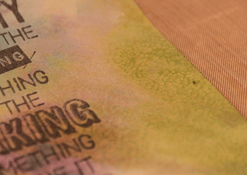
I began with pink cardstock that I embossed with the
Valentine Background Texture Fade. I rubbed wax over the raised words then sprayed it with Candy Apple Red Glimmer Mist. The wax acted as a resist to the Glimmer Mist. I wanted to highlight the letters a little more so I used a brayer and rolled on white acrylic paint in some areas.
I die cut the cupid out of Grunge Paper using the
Love Struck die by Sizzix. I painted it with red acrylic and added some thrifted glitter.
Tim used two strips of the
Vintage Lace Decorative Strip die cut but because I used real Scrabble Tiles for the words I didn't have enough room to place two strips on my tag. So I added one strip along the bottom as a decorative edge.
I made this Vintage Lace decorative edge by using a sheet of thrifted vintage music. It was too fragile to be used alone so I applied some
Tissue Tape along the back to add stability before I die cut it. I further "aged" the sheet music with Tea Dyed Distress Ink.
Because the Heart was the focal point of the tag and I didn't have the honeycomb paper that he used I had to dig through my thrifted stash. I found a silver heart and hand-gathered some old lace into a ruffle to go around the heart.
I had the
Trinket Pin and the
Philosophy Tag in my stash. Among my thrifted treasures I found a vintage earring that added the perfect finishing sparkle to the piece.
I attached the Scrabble tiles in a crooked manner because I liked the playful appearance. The cupid is attached using glue dots that raise it above the card surface for a little dimension.
This has been a great inspiration to get back into the art of creating something everyday. Thanks Tim!
This is linked to:
Craft Envy,
Home Savvy A to Z,
Homemaker on a Dime,
I {heart} Naptime,
Marvelously Messy,
Sew Can Do,
Singing Three Little Birds,
Skip to My Lou,
The Girl Creative and
The Southern Institute